Menu

PASA - Pastel Artists of South Australia

PASA Blog

PASA 20th Anniversary

The First of the Anniversary Articles

January 2021

Brief

We would like to ask our past Tutors to reflect on what it is in their own Art Journey, that lead them to the point they are now in that journey. What influenced them, people who inspired them, why they teach, what changes have you encountered in the last 20 years in your art practice, art materials, surfaces, styles, techniques, how have you evolved as an Artist? These are many ways we can look at the development of our Art Practice. We would be delighted if you would take the time to do this and share it with us in the form of an article to be published in our Dusty Dialogue. In 2021 we are going to have a series of special articles in the DD and also on our website. The articles will then also form a special edition of the DD at the end of the year to commemorate our 20th Anniversary as a keepsake for everyone

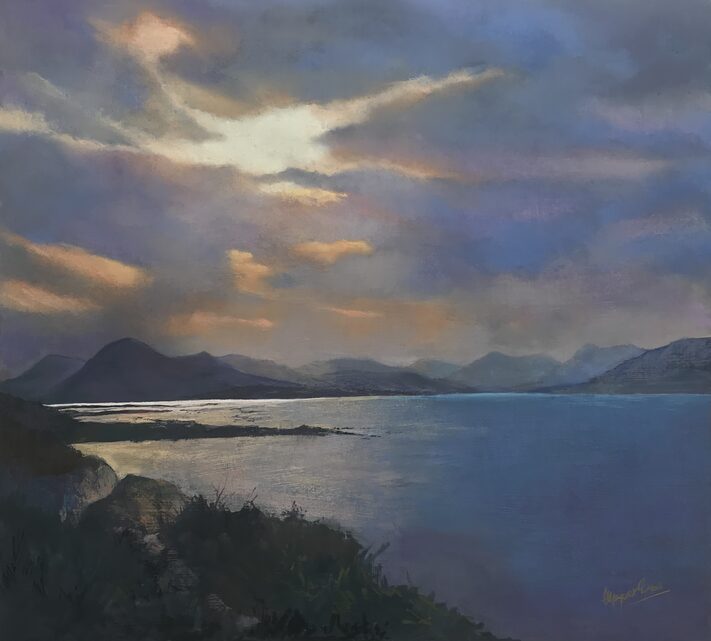
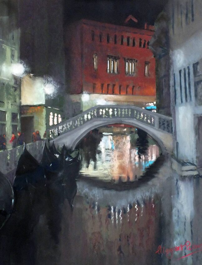
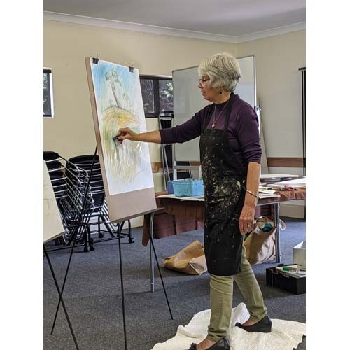
Margaret Evans – My Art Journey 

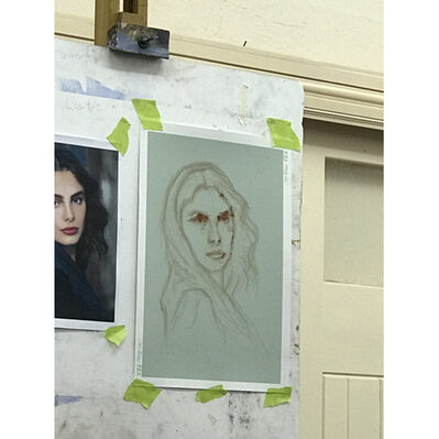
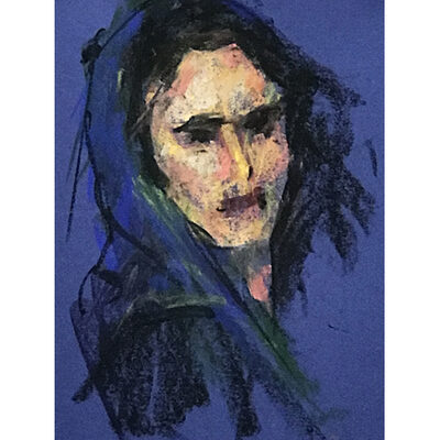
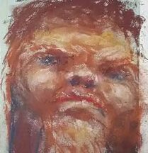
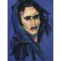
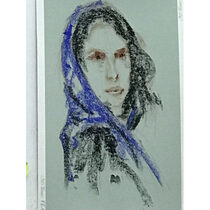
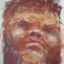
I took the traditional route into Art, by graduating after 4 years at Glasgow School of Art with a Diploma in Art (Drawing & Painting) D.A., followed by a year at the University of London’s Institute of Education for a teaching certificate, A.T.C, which usually leads to becoming a teacher in schools, which did not appeal to me at all!  Being predominantly a portrait painter at this time, I needed to get my name ‘out there’ and be known for what I did best – there is no point in being good at something if no one knows about it!

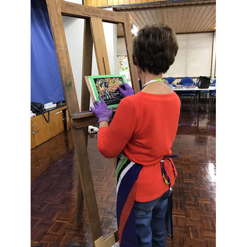
Through gradually meeting and working with art material manufacturers, in particular pastel makers, my work was seen by a big audience, as it was not only used for publications and adverts, but recorded on video for teaching techniques, and subsequently television.  As this audience grew, so also did the catchment widen, as I gradually received invitations to demonstrate and teach from all over the UK and Europe, and later, the USA.  My Art Journey was literally sending me out, travelling around the world, meeting other well-known artists who also travelled globally.  My husband and I had found a way to see the world in the course of earning a living!  We had also by this time, bought an old tumbledown farm steading back in Scotland, and started a business of running art workshops and international painting holidays – Paintaways – all while rearing 2 children and umpteen cats, dogs and trying to build a home! 

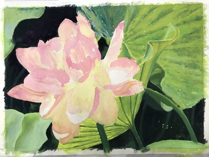
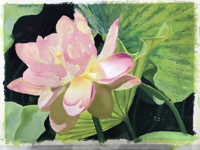
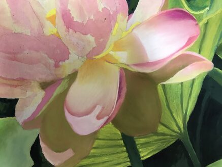
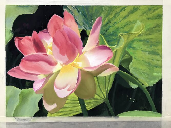
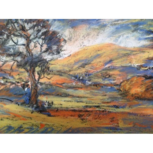
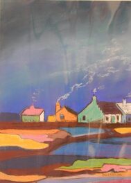
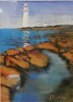
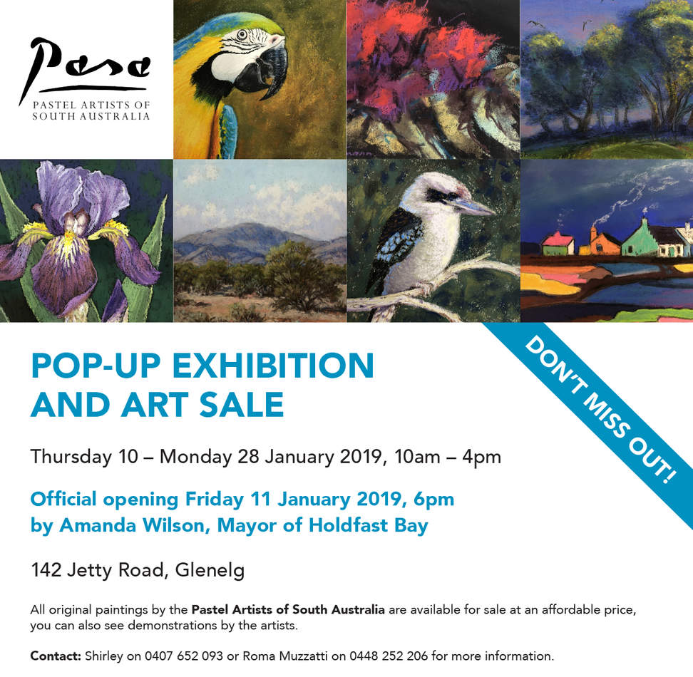
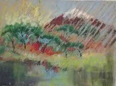
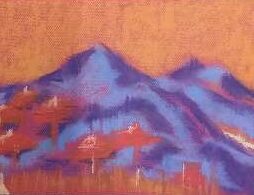
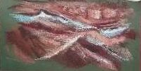
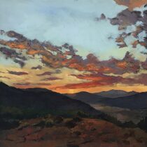
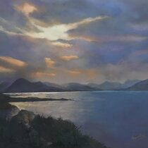
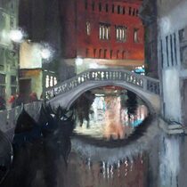
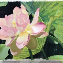
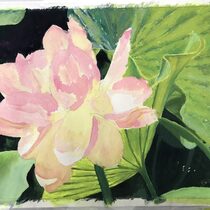
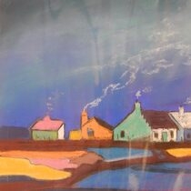
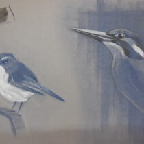
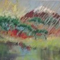
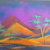
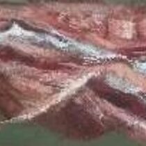
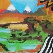
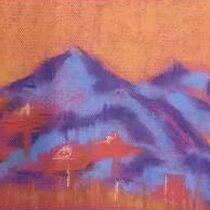
By now, after about 35 years, we have travelled around the world, as far as Australia 3 times, India 3 times, USA (lost count), as well as many annual trips to Europe, all in the name of Painting!   Although trained as an oil painter, my passion for pastels forms the basis of my now collectable artwork, and I have an entire library of books and painting diaries/journals, which not only provide me with a lifetime’s memories of the Art Journeys we have travelled, but an endless source of inspiration for painting for galleries and exhibitions. 

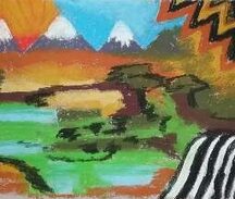
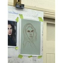
Sadly, Covid has stopped our wonderful Paintaways for the foreseeable future, but my Art Journeys continue in the studio, painting scenes from beautiful places we have visited, and in particular, creating a healthy demand for my Scottish scenes.  I continue to write books on techniques and adventures with Pastels and feel enriched for the wonderful friends we have made along our journeys, who still keep in touch, and many who purchase and collect my work internationally.      Yes -Art Journeys have been a great way to see the world and appreciate what a wonderful world we live in.  We all just have to learn to look after it better, so it will be there for many more generations of young artist travellers to make their own journeys. 

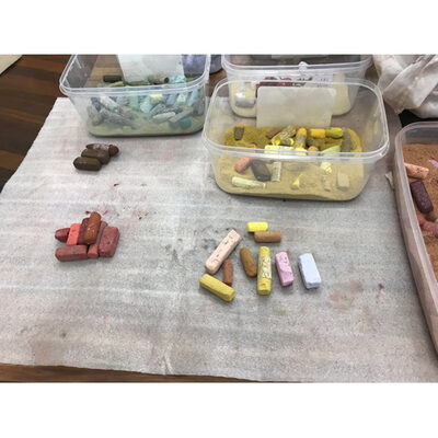
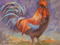
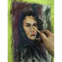
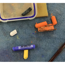
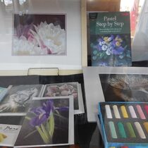
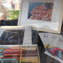
Over the years, meeting many manufacturers and artists, my pastel stock has grown beyond imagination.  What started as a few sets of Daler Rowney’s and a lucky chance to buy some Girault from a shop that was closing down, launched my pastel journey with good brands, & I added to them along the way, finding more brands in France such as Lefranc & Bourgeouis, & anything else that caught my eye, even helping Daler Rowney to develop their pastel pencil range.

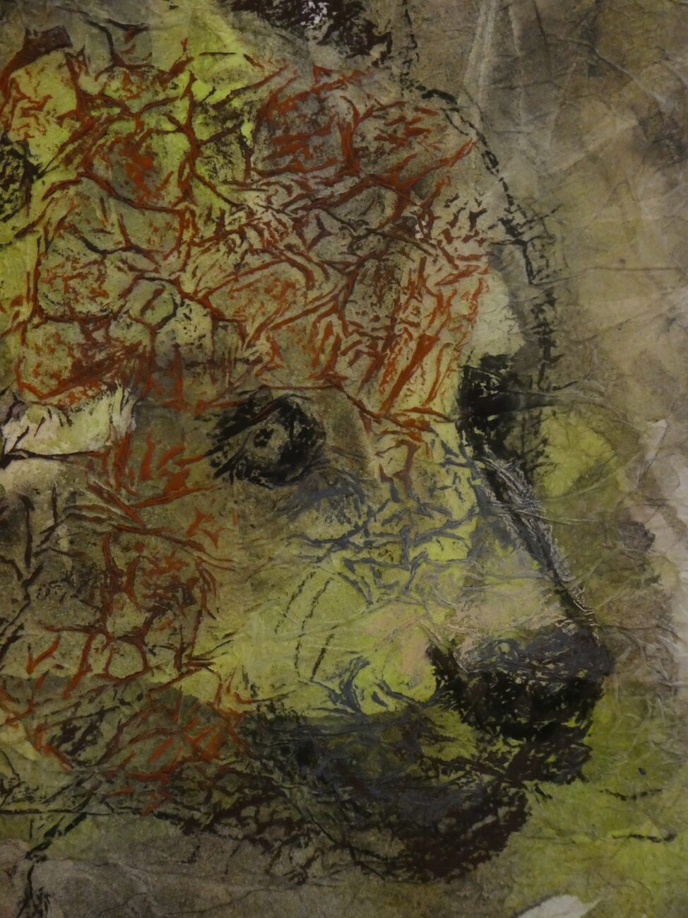
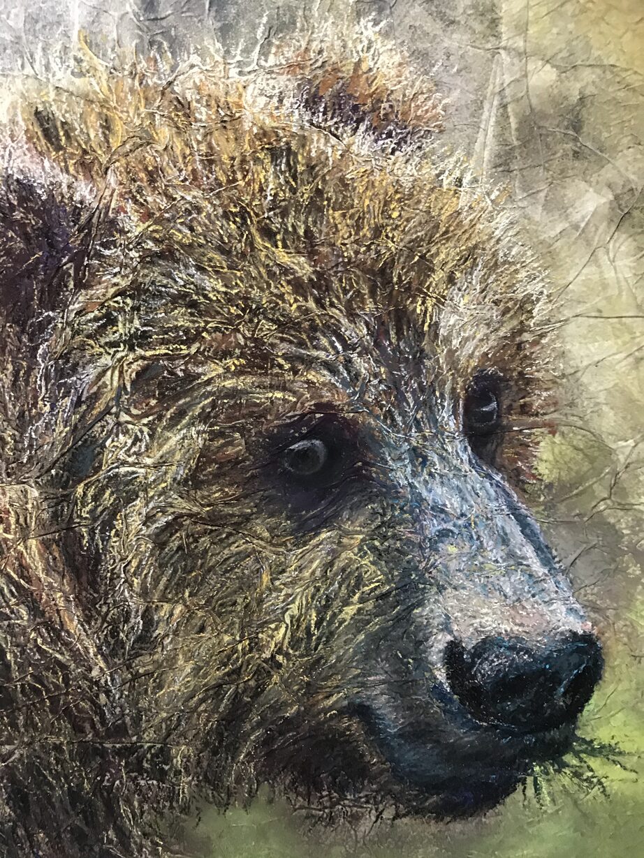
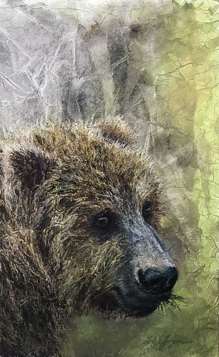
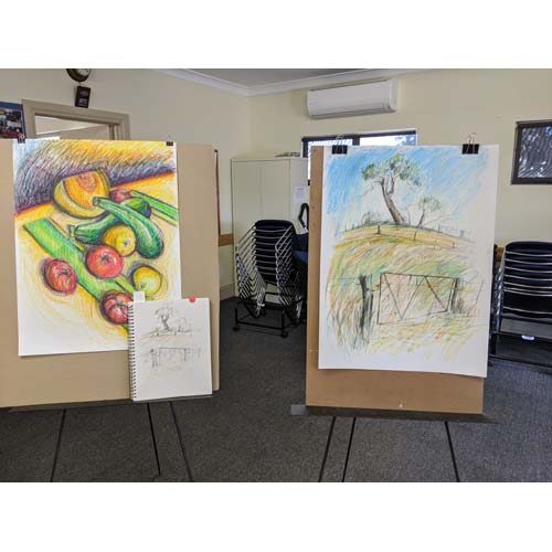
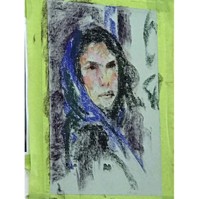
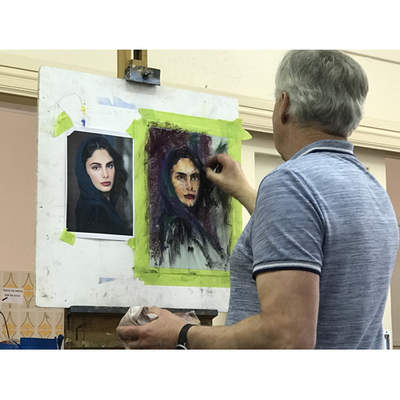
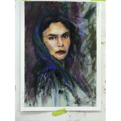
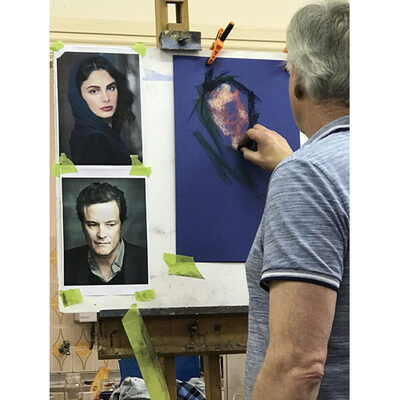
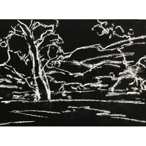
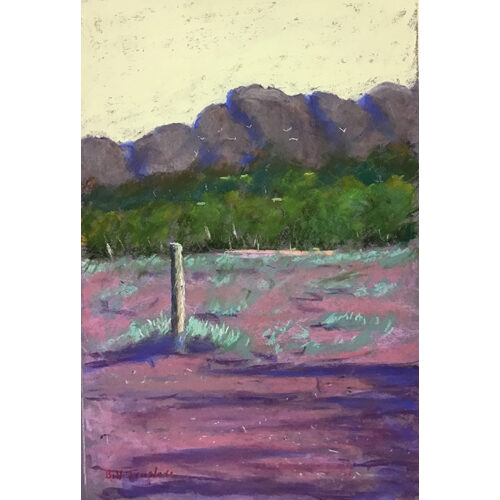
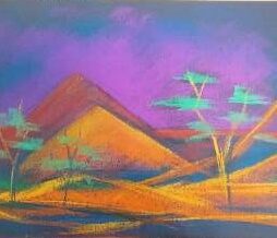
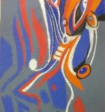
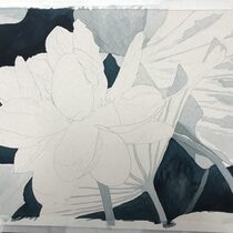
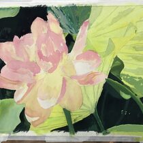
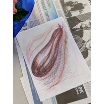
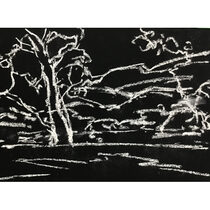
 At that time most papers were similar, such as Ingres, Canson and later, Sennelier’s La Carte.  However, none of these were particularly good for adding water to, and as I developed new techniques by adding water or oils to pastels, creating different textures, I searched for more supports.  By now, visiting the USA and Australia led me to try out heavier supports and I have since loved and used Art Spectrum’s Colorfix papers and boards.  My pastels now consist of Terry Ludwig’s, Blue Earth, Mount Vision & Art Spectrums.   My techniques are varied, but my singular most applied piece of advice is to try EVERYTHING!   There are no bad pastels, supports, techniques.  There are thick, thin, soft, hard, powdered versions, and they all have a use in different ways.  Just don’t get stuck in your ways, predictable and monotonous! Be prepared to take risks, explore, diversify, experiment and have an open mind.  Try diluting pastels with water.  Why should that be difficult?  Pastels are pure pigment.  So, treat them as you would with paints.  Sometimes the subject dictates to me which style, technique or mood I want to create. 

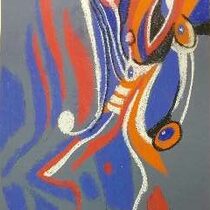
Many artists have inspired me along this journey, and most of them are not pastel artists!  They are stunning oil painters, or brilliant watercolourists, too numerous to mention by name, but each one inspires a mood in their work that tempts me to apply it in my pastels, whether it is subtle, soft, ethereal, or dynamic, dramatic moods.  

Don’t try and copy other artists you admire.  Make up a composite of different elements you like from various artists and apply them to your own work.

And always keep an open mind, willingness to learn and take risks.  And your own journeys will begin! 

BEARLY THERE; A STEP BY STEP PROCESS


  1. Firstly, I have prepared my 3 mm thick masonite board with a ground of gesso (this was  a National Art Materials product which allows you to scratch into it to create texture and also gives the best surface for using inks and binding tissue papers to.)
  2. I scratched some marks into the surface of the gesso before it dried. Then I used a binder medium to glue my previously prepared tissue papers. I had put spots of Art Spectrum Pigmented Inks onto the tissue and used water to spread the inks. Then I laid clingwrap on top of the wet ink and scrunched and pleated it to create a pattern, in my case a tree like pattern. When doing this you need to lay the tissue onto plastic. A kitchen tidy bag cut open is ideal as the tissue needs a support until it is dry. Once dry you peel off the cling wrap and remove the tissue from the under plastic support. 
  3. After gluing the tissue onto the masonite support, wait until it is dry, then coat the surface with a layer of Art Spectrum Clear Colourfix Primer. Allow to dry.
  4. Next comes the drawing stage, here I have used a pastel to draw my bear roughly.
  5.  From here I added more soft pastel and rubbed it in to the surface as I had a lot of very deep texture marks scratched into the surface so the pastel mostly sat on the ridges.
  6. Following on, I used more hard pastels (mostly nupastels) than soft and a few pastel pencils, using a very light touch to layer over and over until I got the effect I wanted, working on the eyes to get the depth of the eye sockets and then the nose before turning to the fur, in general occasionally alternating between soft (Terry Ludwig, Schminke & Unison) pastels and the nupastels for more detail.
  7. The fur texture looks very detailed but only because I had a lot of scratch marks in the original ground which created ridges for the pastel to adhere to.
  8. Finally, I dragged soft pastels over the background to soften the look of the “trees” and to create a look of a forest, being careful not to completely cover the original colours in the tissue papers. Some of the background colours are also repeated in the bear to integrate him into the background. I like the feeling of the bear just appearing out of the forest but being a part of it also, not a separate entity.
  9. I hope you find this an interesting process and are inspired to have a go. It is a lot more time consuming than using Colourfix or other paper but much more rewarding in the unique results you can achieve.

Words & pictures copyright of  Lesley Jorgensen. September,2020.

The Workshop We Didn't Have

In March 2020 PASA had a 'Flower Portrait' workshop booked with Queenland Master Pastellist, Lyn Diefenbach.  Unfortunately, due to the Coronavirus it was cancelled, hopefully to be re-booked at a future date. However, as we were to have our flowers drawn up before the workshop, and had put aside that weekend for painting anyway, I suggested everyone go ahead and paint their flower. Many did, with beautiful results, and they were shown on the PASA Facebook page. For those of you who didn't see them there, I would like to describe my 'Flower Portrait' progress steps. We were asked to use Uart 600 grade sanded pastel paper, a first for many of us. It is a very fine toothed paper, much less rough than AS Colourful, but not as smooth as AS Colourful Smooth. This was as off white coloured paper. Uart make seven grades of paper from 240 (very rough) through to 800 (extra smooth). They also make a black paper in grades of 400, 600 and 800. In Australia we can purchase Uart paper from www.softpastels.com.au.

I decided to use diluted AS Pigmented Inks as an underpainting to see how they performed on the Uart paper. I don't think I would again as the paper buckled quite a bit. I think AS Colourful is a much more robust paper for wet effects. As I covered the entire paper with pastels, I could have eliminated this step. I used a variety of pastels from AS Soft (original), Winsor & Newton, some very soft Terry Ludwig and Schminke pastels before using a few pastel pencils to sharpen up the details. I worked through my background before painting the flower, turning the paper every now and then so I didn't get dark pastel dust over the more delicate colours of the flower. I hope you enjoy viewing the painting steps and the finished result.

Words and pictures by Lesley Jorgensen,

PASA Workshop Convenor.

Demonstration by Helen Stacey at Victor Harbor

Adventures with oil pastels

Guest artist Helen Stacey writes:

It was a great delight to spend time with the pastel artists group in Victor Harbor last Saturday afternoon as we explored ways of working with oil pastel. Two large still life works featuring oil pastel showed the potential of this multimedia approach.  

During the workshop I was very impressed with the way all those exploring the medium of oil pastel combined with turpentine and graphite created such lively experimental works.  

In the initial demo and trial drawing we worked with three oil pastels (3 warm and cool colours) and a soft graphite/lead pencil, mineral turps applied with a bristle brush on photocopy paper.

Simple steps were demonstrated.  Firstly, ways of holding and manipulating the oil pastel and pencil so each person could discover how to have full control of the medium and explore its potential in their own style.  Then there was great excitement when it was revealed that turps, a solvent for graphite and oil pastel, could be brushed on to blend and extend the oil pastel.  Then amazement grew when graphite/lead pencil was applied to shade in darker tones and bring out detail - it gave much deeper, richer tones and enriched the work.  

Then people applied this knowledge in an experimental study of a piece of fruit.  

- first the contour and basic detail of the fruit was drawn using the lightest colour

- then artists used their three colours to build the fruit’s form, observing tonal changes (light and shade), leaving white paper for highlights

- using the bristle brush with turps the oil pastel was blended and extended following the contours of the fruit.  Lighter tones were created by the way the brush with turps softened and dissolved the oil pastel

- then the form was modelled using the graphite /lead pencil to shade in darker tones and surface details 

- on a separate demonstration work I showed how white acrylic paint could be added to areas to emphasise light and to add highlights where needed.

I was so pleased to see the way every one handled their experimental work, asked so many questions - and seemed to enjoy the many stories I told !! 

Thank you to the person who showed us the drawing package from Office Works that included a special graphite stick - all for $22.

We also spoke about the Stationmaster’s Art Gallery at Strathalbyn where groups or individuals can book a room or two or even the whole gallery. It would be wonderful to see the best work the artists in the VH pastel artists group could show at the SMAG in the future. 

 A warm welcome is extended to all members to visit my studio-galley in Strathalbyn - 17 Harriet Street, off North Parade.   Please phone ahead (85 363 069) to make a time to visit and stay for a cuppa.  In November I will be having a re-run of my retrospective exhibition at the Stationmaster’s Art Gallery, HORIZONS.  I’ll send you an invitation later on. 

My best wishes to everyone and thank you for a wonderful afternoon with you all.  

Helen


Trevor Newman Workshop June 15, 2019

 For the 13 people who attended Trevor’s second Expressive Portrait workshop last month, the emphasis was on enjoyment, of which there was plenty. Trevor’s entertaining style of teaching is very thorough, educational, full of *pearls of wisdom and FUN. It was an amazing learning experience from a master of the medium and the genre.

 In this workshop we learnt to use more realistic colours in our work as opposed to the unusual colours and papers in the first workshop in March. For those of us who attended the first workshop this was a natural progression to build on what we had already learned and for the new students a way to begin. 

Paper choice was the first point covered    both texture and colour were discussed

Eg.-light skin….light coloured paper ; dark skin….dark coloured paper

Trevor used a mid-tone paper for the demo portrait of actor Selma Hayek, choosing a blue/green as a complement to her slightly warm pinkish skin colour.  The next step was to complete a small notan (black & white) drawing to see the tonal range. With a colour photograph squint to see the tones or use a b&w photocopy to determine tones.

Notaniser app is available for phone or tablet. *a pearl of knowledge

Trevor talked a lot about colour

If your model is in cool light, your shadows will be warm, conversely, if your model is in warm light you will have cool shadows. Therefore the lighting also helped him to make his choice of colour paper.  If you want to make a colour stand out use the complementary colour next to it. Also use your darkest colour against your lightest colour. Use a complementary colour on top of another colour to neutralise it. (it greys the original colour).  A colour will vary in relation to what is next to it.

Next he chooses his palette   looking at values/tones.

First he is looking for warm darks for the shadows. He selects colours with a red/orange tint for his mid tones. Then his darkest darks are a yellowish brown and charcoal.  Trevor doesn’t have a problem introducing a black.  His lights are on the cool side; yellows, pinks, blues.

Beginning the Demo

He starts broadly & lightly with the pastel on the side and works from dark to light. He lightly conserves the tooth of the paper. He continues to work broadly eliminating detail, which makes it easier to adjust the work. He puts in shadow areas in reddish brown, establishing the eyes, nostrils and lips. He covers over the eyes in black. The hair is dark so he puts that in using black and adds colour onto that as black should never be alone. Trevor adds in blue (cobalt & ultra marine) for scarf.

Next he works on the background and, as he is using a light coloured paper, he needs to put in some darker tones. If he were using a darker paper he wouldn’t necessarily need to paint in a background.

Flinders Red Dark is added on the left hand side of the background, overlapping the colour onto the hair and side of the face, this turns the edge of the face giving form (roundness). He leaves some of the paper colour on the right side because tonally works.

Trevor continues adding dark to the top of the eyes, pupils, nostrils, and shadow line of the mouth – now beginning to refine. The eye and then the shadow above the eye are similar in tone/value.

Black works better if you put it down first then overlay with colour. *a little pearl of wisdom

ALWAYS STEP BACK AT EACH STAGE. You can ONLY be OBJECTIVE when you step back.  *another pearl of wisdom

It is important that the face be tonally correct so once you add your background you can reassess and if necessary change your choices for the face. The background colours influence the colours in the face.

Next Trevor adds warm pinks & reds in the shadows, yellow & ochre colours in the light areas. Then he adds blue/purple on the shadows. For the lips; cool red, top lip more blue red, bottom lip more red. He uses green/brown in the neck shadow and on the side of the face. He uses the lightest touch with the little finger to move and soften edges of light and dark areas on the face. He adds more colour to the background & hair, dashes of colour from one area into another, still using the side of the pastel. Warm & cool, dark & light, soft & hard edges gradually building up and refining. 

So far he has been working in mid tones & darks and now he adds the highlights. Firstly he adds the cooler colours. Again value/tone are the most important here NOT the colour.  The face is a mosaic of colours, blues, greens, reds, pinks, purples and yellows. He adds colours then uses little finger to gently push, pull and smudge edges in the planes of the face. He uses a light purple for the cool highlight.

At this stage he used a charcoal pencil to render the eyes more accurately slowing down the process to concentrate on the details wanted. Eye whites are a cool colour, bluish not white.

Still working from dark to light he draws the lips as one shape, using a large brush to feather out pastel on the face and to smudge slightly. He adds some of the dark cool red from the lips to the shadow above the eyes, hair and shadow side of the face.

Step back and assess BEFORE finishing. Preferably take a break and come back with fresh eyes. Then do any adjusting needed. *pearl

All the time he is trying to keep the face out of focus until the end. He adds some last cool highlights.

Near the end of the first day Trevor suggested to have a bit of fun using the colours you have out, using a dominant paper colour eg: very strong purple, don’t draw but just throw colour on at random doing a background and a quick portrait exercise.

The second day we used alcohol over pastel to create a base on white paper to then paint over in pastels.

Lesley Jorgensen.


PASA Artists Surprise Themselves Using Only Five Pastels

At our April meeting at Sturt, Liz Gartner challenged PASA members to paint a scene using only 5 pastels, one shade of red, one of blue, one of yellow and black and white on black paper. The lament of pastel artists is that no matter how many colours they have, they can often not find the right colour. Well that excuse was blown out of the water when they all took up the challenge put to them. Liz demonstrated using her chosen 5 pastels on black paper and then it was the members turn to have a go. As Liz pointed out tone is more important than colour. If you get that right then you will have a very readable painting. Members were pleasantly surprised at the little gems of paintings they achieved. So no more excuses that you don’t have enough pastels.


Great PASA Gathering at Gawler

A very successful inaugural PASA meeting at Gawler was held on Thursday March 14th with over 30 people attending from many places north of Adelaide. It was fitting that PASA Founding Member Bill Truslove was the demonstrator. He delighted the audience with his two paintings. One was a painting of the Flinders Ranges and the other a beautiful seascape. PASA is delighted to welcome 10 new members who joined on the day. Many more are keen to join. 


Pop-up Exhibition at Glenelg

Don't worry if you have spent all your spare cash on Xmas presents; all these 8x10 paintings, unframed, are only $90 each.  Then you can save up for the framing, on which some of our supporters are offering 10% off on these paintings only.  There are landscapes, urban scapes, animals, and a variety of other subjects; there are professional and emerging artists; all wrapped up and ready to take home.  Even while we were setting up, we sold 4 paintings but there are many more!  It begins today and the grand opening is Friday night at 6pm - and it should be cooler than the predicted 39 degs at the beach.  Hope to see you all there.


                                                 All done!                                                              


It's On Again!

Remember 2016?  When we held a pop-up exhibition on Jetty Road, Glenelg?  Well, it's on again!  And this time, the paintings, all 6 x 8 inches, are ready for your personal framing preferences.  And, all at the one price of $90 each.  All welcome to the Opening Night.


Painting to Music

Sounds wacky but turned out to be a lot of fun and the participants who came to the Cooinda meeting yesterday surprised themselves.  Diane O'Brien led the group as she played a song from 1982, I Bless the Rain in Africa.  After a brief insight into the meaning of the lyrics, we were encouraged to use our imagination.  This is only a small sample of what we came up with:

View older posts »