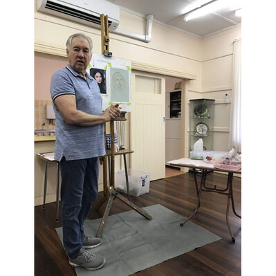
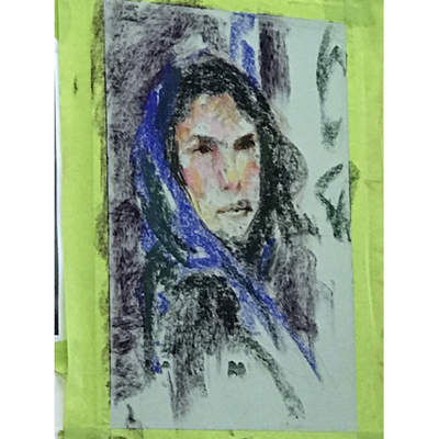
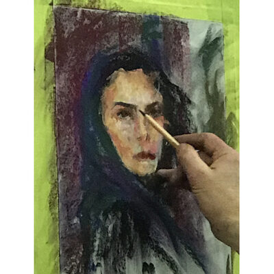
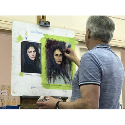
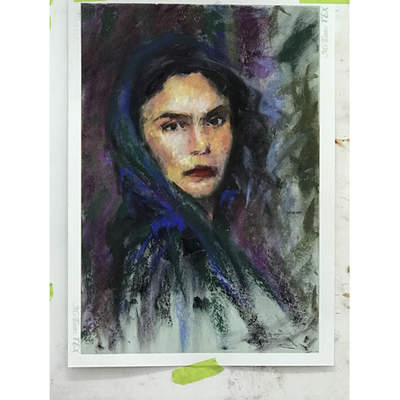
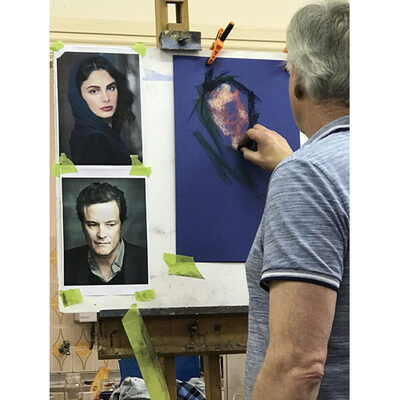
For the 13 people who attended Trevor’s second Expressive Portrait workshop last month, the emphasis was on enjoyment, of which there was plenty. Trevor’s entertaining style of teaching is very thorough, educational, full of *pearls of wisdom and FUN. It was an amazing learning experience from a master of the medium and the genre.
In this workshop we learnt to use more realistic colours in our work as opposed to the unusual colours and papers in the first workshop in March. For those of us who attended the first workshop this was a natural progression to build on what we had already learned and for the new students a way to begin.
Paper choice was the first point covered both texture and colour were discussed
Eg.-light skin….light coloured paper ; dark skin….dark coloured paper
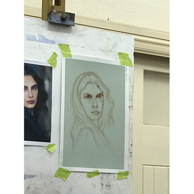
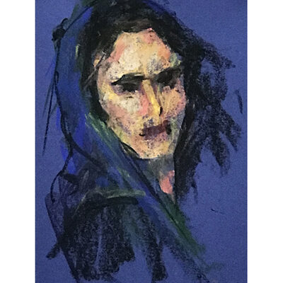
Trevor used a mid-tone paper for the demo portrait of actor Selma Hayek, choosing a blue/green as a complement to her slightly warm pinkish skin colour. The next step was to complete a small notan (black & white) drawing to see the tonal range. With a colour photograph squint to see the tones or use a b&w photocopy to determine tones.
Notaniser app is available for phone or tablet. *a pearl of knowledge
Trevor talked a lot about colour
If your model is in cool light, your shadows will be warm, conversely, if your model is in warm light you will have cool shadows. Therefore the lighting also helped him to make his choice of colour paper. If you want to make a colour stand out use the complementary colour next to it. Also use your darkest colour against your lightest colour. Use a complementary colour on top of another colour to neutralise it. (it greys the original colour). A colour will vary in relation to what is next to it.
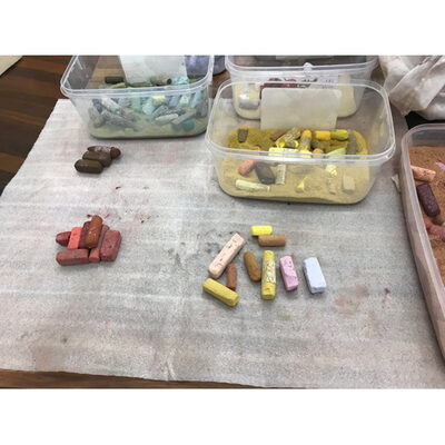
Next he chooses his palette looking at values/tones.
First he is looking for warm darks for the shadows. He selects colours with a red/orange tint for his mid tones. Then his darkest darks are a yellowish brown and charcoal. Trevor doesn’t have a problem introducing a black. His lights are on the cool side; yellows, pinks, blues.
Beginning the Demo
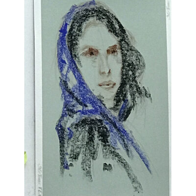
He starts broadly & lightly with the pastel on the side and works from dark to light. He lightly conserves the tooth of the paper. He continues to work broadly eliminating detail, which makes it easier to adjust the work. He puts in shadow areas in reddish brown, establishing the eyes, nostrils and lips. He covers over the eyes in black. The hair is dark so he puts that in using black and adds colour onto that as black should never be alone. Trevor adds in blue (cobalt & ultra marine) for scarf.
Next he works on the background and, as he is using a light coloured paper, he needs to put in some darker tones. If he were using a darker paper he wouldn’t necessarily need to paint in a background.
Flinders Red Dark is added on the left hand side of the background, overlapping the colour onto the hair and side of the face, this turns the edge of the face giving form (roundness). He leaves some of the paper colour on the right side because tonally works.
Trevor continues adding dark to the top of the eyes, pupils, nostrils, and shadow line of the mouth – now beginning to refine. The eye and then the shadow above the eye are similar in tone/value.
Black works better if you put it down first then overlay with colour. *a little pearl of wisdom
ALWAYS STEP BACK AT EACH STAGE. You can ONLY be OBJECTIVE when you step back. *another pearl of wisdom
It is important that the face be tonally correct so once you add your background you can reassess and if necessary change your choices for the face. The background colours influence the colours in the face.
Next Trevor adds warm pinks & reds in the shadows, yellow & ochre colours in the light areas. Then he adds blue/purple on the shadows. For the lips; cool red, top lip more blue red, bottom lip more red. He uses green/brown in the neck shadow and on the side of the face. He uses the lightest touch with the little finger to move and soften edges of light and dark areas on the face. He adds more colour to the background & hair, dashes of colour from one area into another, still using the side of the pastel. Warm & cool, dark & light, soft & hard edges gradually building up and refining.
So far he has been working in mid tones & darks and now he adds the highlights. Firstly he adds the cooler colours. Again value/tone are the most important here NOT the colour. The face is a mosaic of colours, blues, greens, reds, pinks, purples and yellows. He adds colours then uses little finger to gently push, pull and smudge edges in the planes of the face. He uses a light purple for the cool highlight.
At this stage he used a charcoal pencil to render the eyes more accurately slowing down the process to concentrate on the details wanted. Eye whites are a cool colour, bluish not white.
Still working from dark to light he draws the lips as one shape, using a large brush to feather out pastel on the face and to smudge slightly. He adds some of the dark cool red from the lips to the shadow above the eyes, hair and shadow side of the face.
Step back and assess BEFORE finishing. Preferably take a break and come back with fresh eyes. Then do any adjusting needed. *pearl
All the time he is trying to keep the face out of focus until the end. He adds some last cool highlights.
Near the end of the first day Trevor suggested to have a bit of fun using the colours you have out, using a dominant paper colour eg: very strong purple, don’t draw but just throw colour on at random doing a background and a quick portrait exercise.
The second day we used alcohol over pastel to create a base on white paper to then paint over in pastels.
Lesley Jorgensen.
